 ‘Have a FREE account for up to 2000 subscribers!’
Sounds like a great deal doesn’t it?
That’s part of what enticed me to set up with Mailchimp.
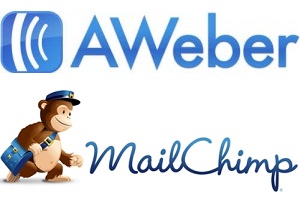
Aweber at first glance looked like it was going to be the more professional outfit but, content that I could list build with my businesses up to 2000 before I would have to pay a single penny, I stuck with Mailchimp. For about 2 weeks.
I did a bit more research, and a quick comparison of the features, and I knew there were several good reasons why I should cut my losses, sign up for Aweber and spend several hours, setting up the various lists and auto responder messages that I needed, in order to replace what I already had in place across several websites.
Why did I change? read on…
User Interface
I would describe the user interface for Mailchimp as clunky to say the least. It looks almost childlike with over exaggerated sized menus and screen, with an overall cartoon feel. There were numerous occasions I found myself going round in circles and getting very frustrate with the whole thing.
As with any new tool there is going to be a period of learning, as you get to grips with the various settings and understand what goes where, in order that you can create optin forms designed to look exactly the way you want them to.
What’s an optin form?
An optin form is something that looks very simple but there is always more to it than meets the eye and most businesses don’t totally understand why they are not getting as many subscribers as they thought they would.
This is an optin form:
You can use an optin form that people can use to register for a newsletter, just like in top right corner of this page. The one just above here in this post is actually the same code, if you were to fill it in, you would be signing up for my weekly newsletter. It only looks a little different because I haven’t added the heading or the arrows.
It’s obvious that the more subscribers you have, the bigger your audience, so that when you have a new product launch or something significant to announce, the more people that will see it and the greater the effect. You should also make important announcements on social media too, but the difference is that whereas it is very easy to miss something on social media, its very hit or miss with email marketing it lands straight in their inbox.
Optin Design
I hinted that there was more to the design and format of the optin than meets the eye. You could, if you wanted, set your optin to require 10 different pieces of information to be filled in. Most of them ask for about 2 or 3, such as First Name, Surname, E-mail address, but what’s the one piece of information that you really need? An e-mail address. That’s all you need actually. Sure you could personalise a message by adding the code for the person’s first name, but it doesn’t make much of a difference in the long run, what does make a difference is that studies have shown, the more pieces of information that you ask for, the lower the conversion rate of visitors to subscribers.
So, by all means, if you really feel compelled to know someone’s name then leave it in there, but it will cost you in the long run. Keep it plain, simple and with the least amount of distractions.
Single Optin versus Double Optin
The secret to marketing is in the detail. Every single detail is important. Which typesetting works the best for which industry? What size should it be? What colour gets the best conversion rate? After you’ve gone to all the trouble to get a visitor to your website, to then get them to sign up or subscribe to your list, the last thing you want them to do is unsubscribe or not complete the process. You’ve already learned that the more information someone has to complete the less inclined they are to actually fill it in, well, it will come as no surprise to you, that the more steps there are in the process the less likely they are to complete it. This is the difference between single optin and double optin.
Single optin – Someone fills in the form, clicks on the subscribe button and receives a confirmation e-mail that they’ve subscribed.
Double optin – Same as above, however, the message they get says,”Hey, did you really want to sign up? Are you sure? If you are, then click AGAIN and we’ll make sure we add you this time’. The effect of this? There’s a drop off on the numbers that complete this second stage.
This is where Mailchimp falls down. Both Mailchimp and Aweber have the same double optin setup by default. Its a measure implemented as a result of CAN SPAM, to make sure that people’s addresses aren’t added by someone else, without their knowledge. With Mailchimp you can’t switch it off, with Aweber you can.
And The Winner Is?…..
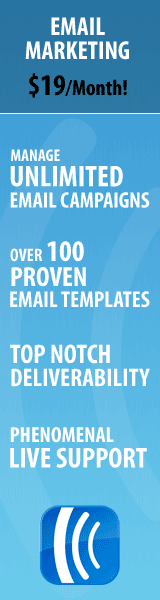
For the sake of $1 a month for the first month and $19 a month afterwards, quite frankly the difference in subscribers alone is more going to more than pay for the small cost of this tool.
When you get into Aweber and see all of the built in tools and functionality they have, you realise it is the smart choice. it is clearly laid out, there are instructions well laid out to guide you through every stage of setting up what you need and compared to Mailchimp, its a breath of fresh air.
So, if you don’t have an optin on your website, and you’re not list building yet, what are you waiting for? For a mere $1 for the first month, why not give it a try. And if you need any help feel free to send me a message.